Problem
Visitors didn’t know if they needed a test, what the first visit involved, or whether booking meant committing to buy a device.
A clearer, more trustworthy hearing-care experience for patients and the family members deciding with them.
Sonovit is a family-owned hearing clinic in Guadalajara and Zacatecas. I redesigned its website so uncertain visitors can understand the process and book an evaluation — without feeling sold to.
32 evaluations booked and 180+ taps on the booking CTA in the first 60 days after launch.
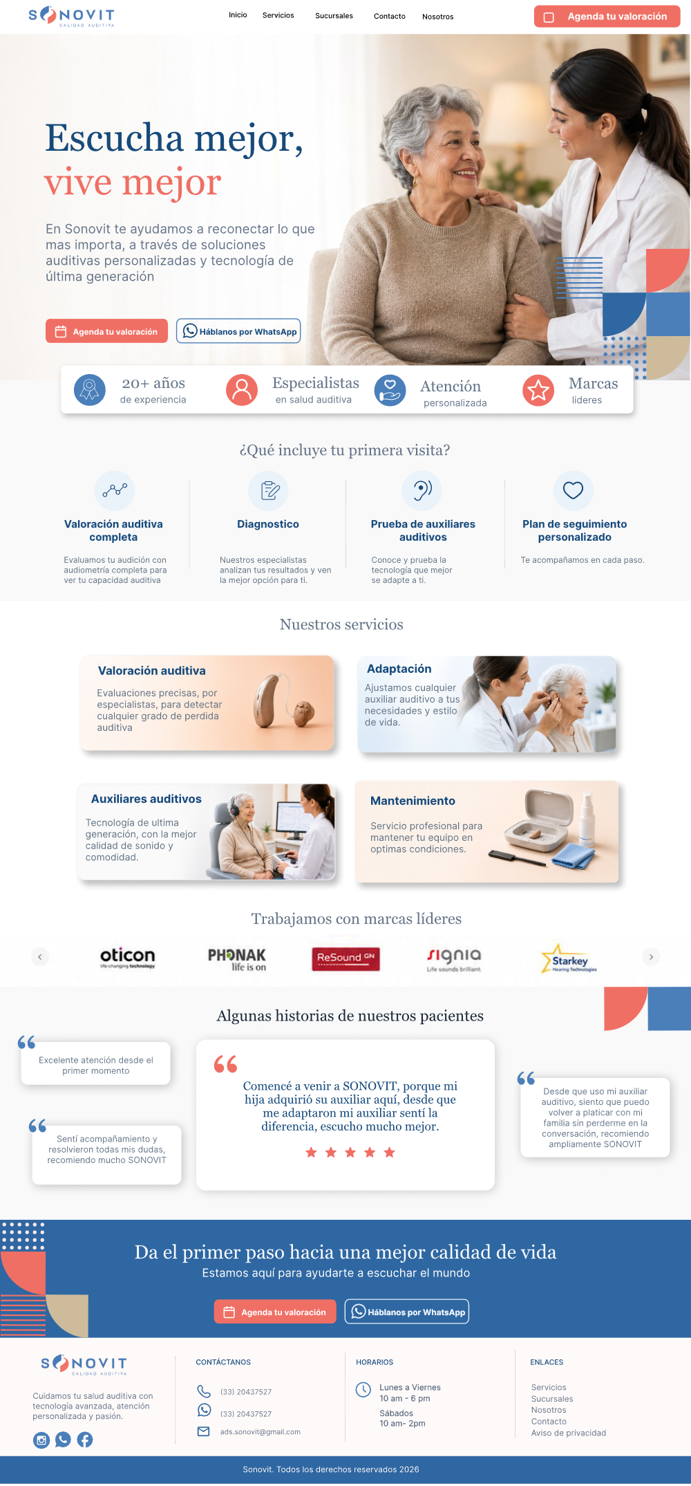
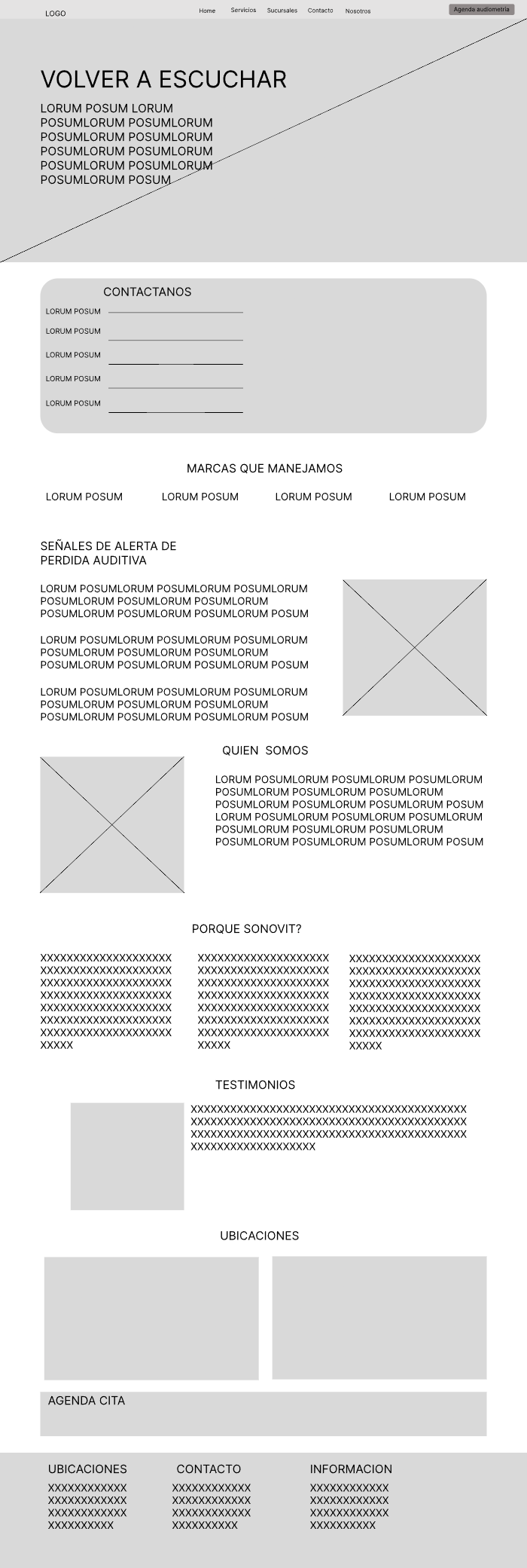
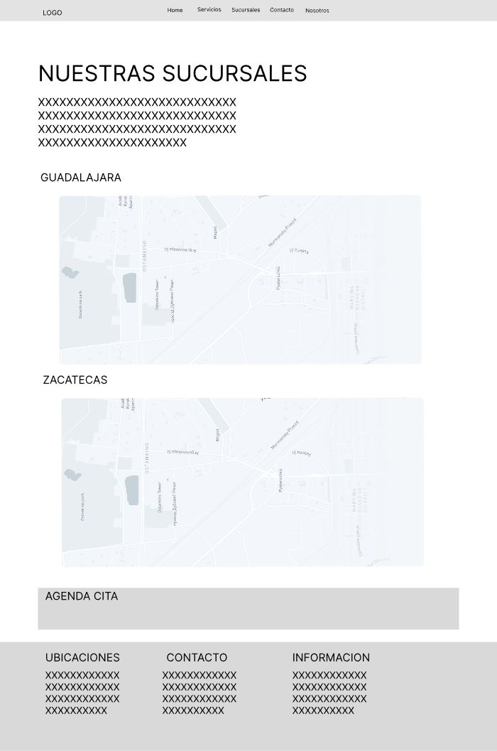
Sonovit depended on referrals, WhatsApp chats and staff explanations for information the website should have carried.
Visitors didn’t know if they needed a test, what the first visit involved, or whether booking meant committing to buy a device.
Explain the care process, build credibility, and make booking an evaluation low-friction.
A five-page website that reframes the first step as an evaluation — not a purchase — designed to convert research into qualified appointments.

“I want to know if my dad really needs hearing aids — and feel confident someone will explain the options before we buy anything.”
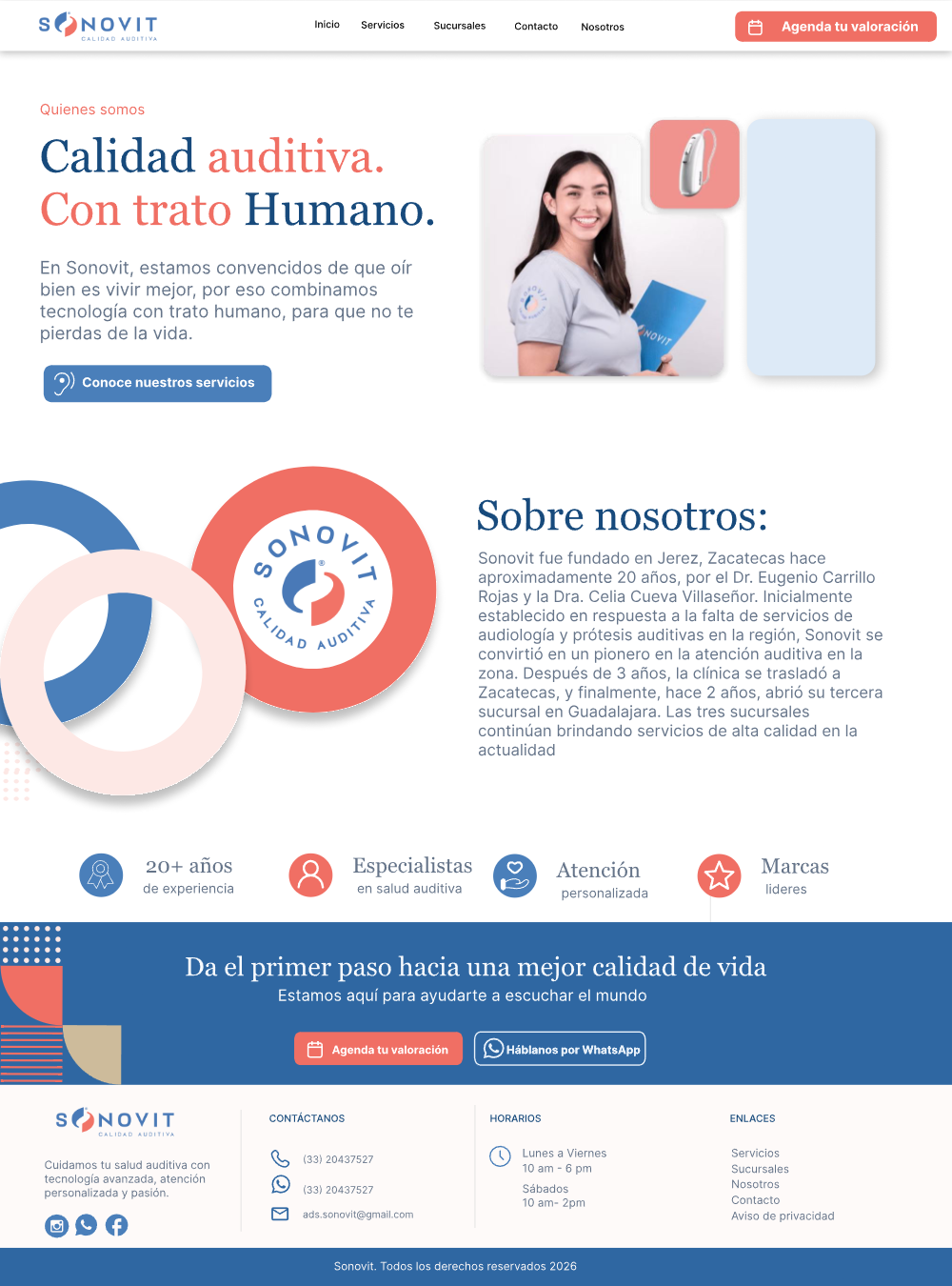
The person researching is often not the patient — so the site speaks to both.
Stakeholder interviews, recurring WhatsApp and phone inquiries, and a five-competitor audit all pointed the same way.
Family members start the search after noticing louder TVs and skipped gatherings — copy had to give caregivers a starting point too.
Buy a device? See a doctor? Take a test? A product-first website confirms the fear that the clinic just wants to sell.
Real addresses, hours and recognizable brands build more trust than any “trusted care” tagline.
It lets people ask questions before committing. It converts — but it can’t be the only door in.
I restructured the site around the visitor’s five real questions and kept navigation deliberately shallow — older users shouldn’t need audiology vocabulary to find their way.
Trade-off: a shallow structure is easier to navigate but gives up dedicated service pages for SEO. I chose clarity first; landing pages can follow search demand later.
Two speeds, one flow: high-intent users jump straight to contact from anywhere; uncertain visitors build confidence step by step.
I tested the core tasks — understand the offer, find a branch, schedule an evaluation, contact by preferred channel — and iterated on what actually blocked people.
Users scanned headings and skipped dense paragraphs — and some hesitated to book, fearing a sales conversation. Every iteration lowered perceived risk or made the next step more obvious.
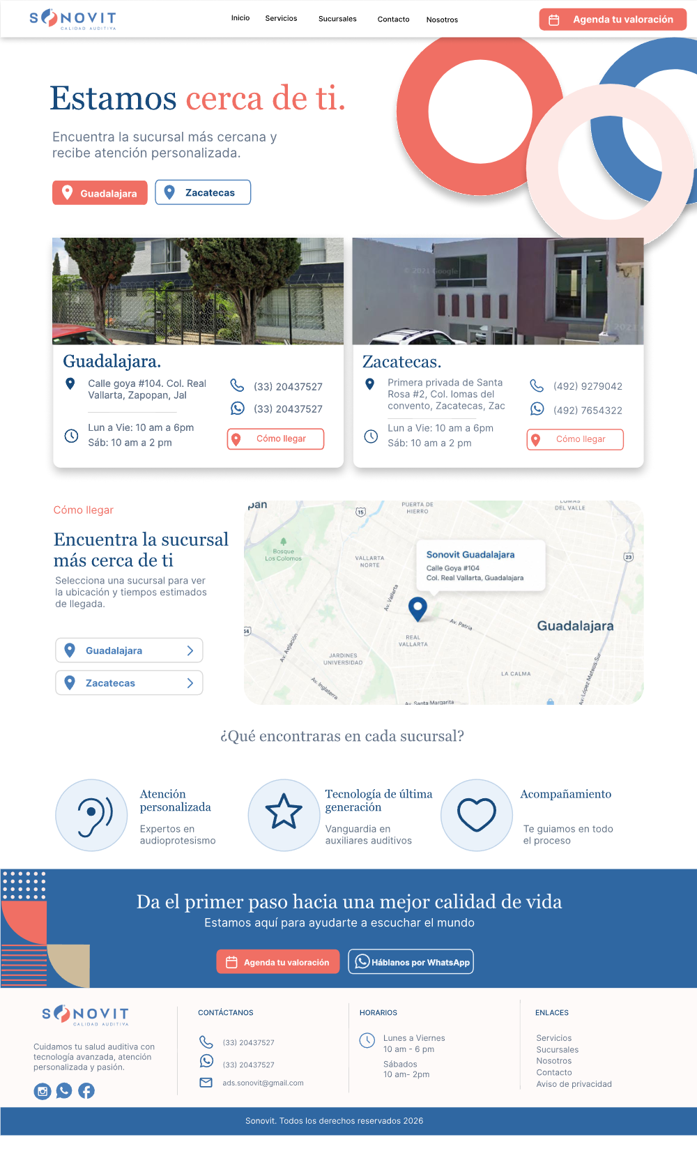
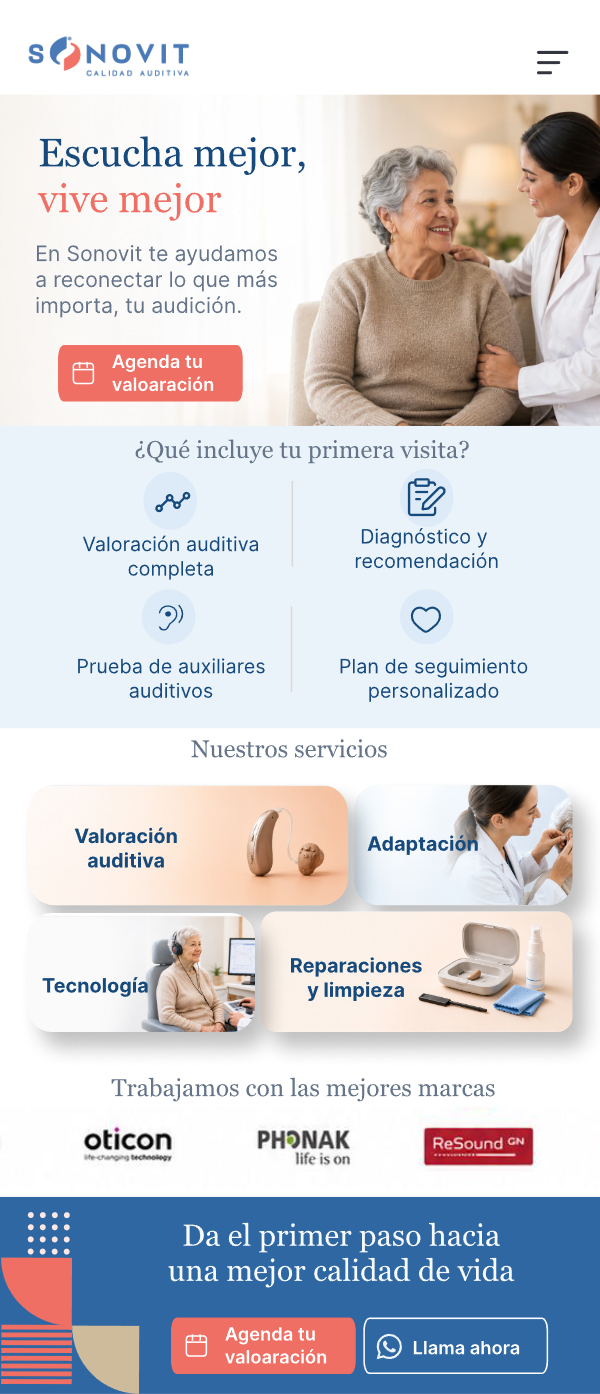
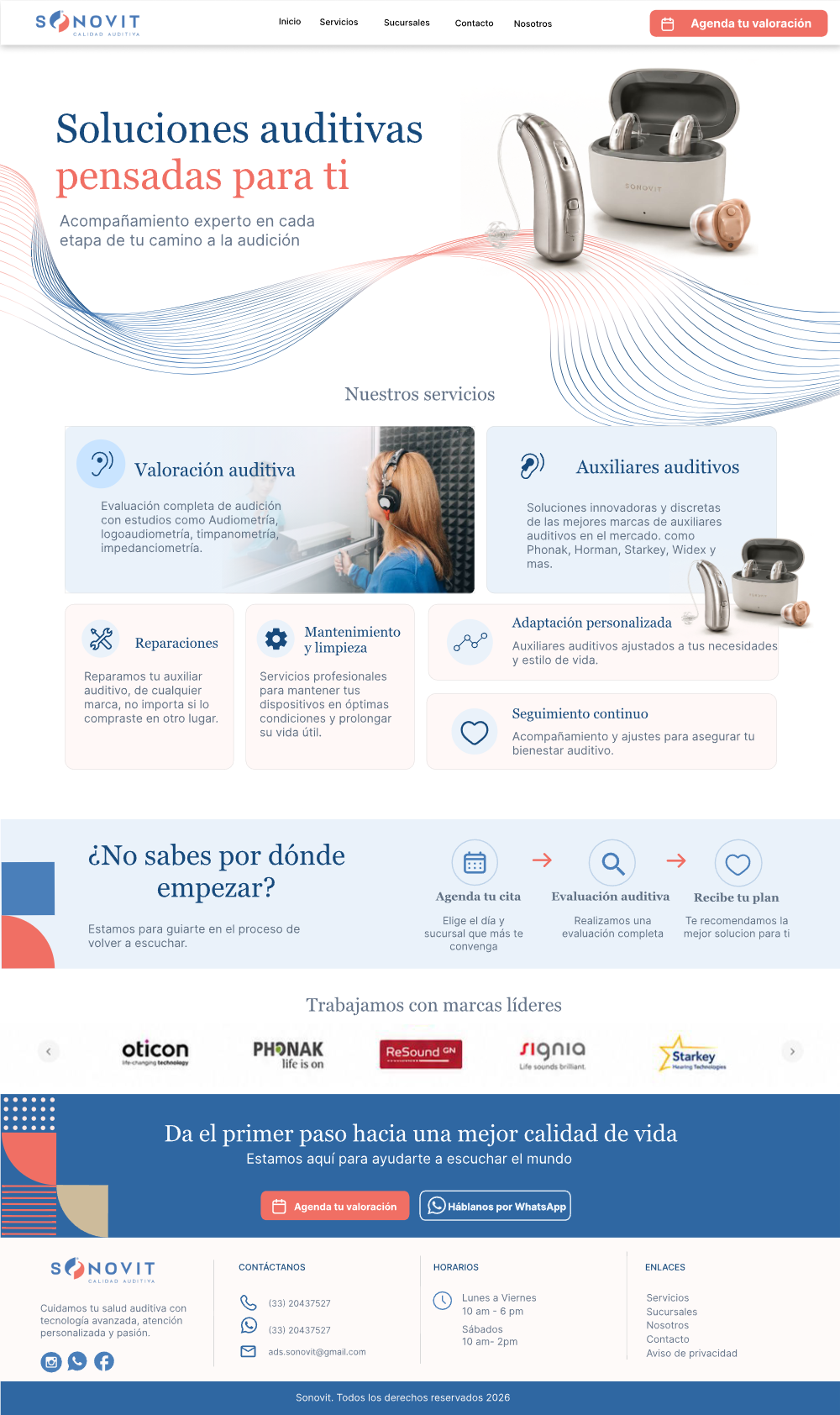
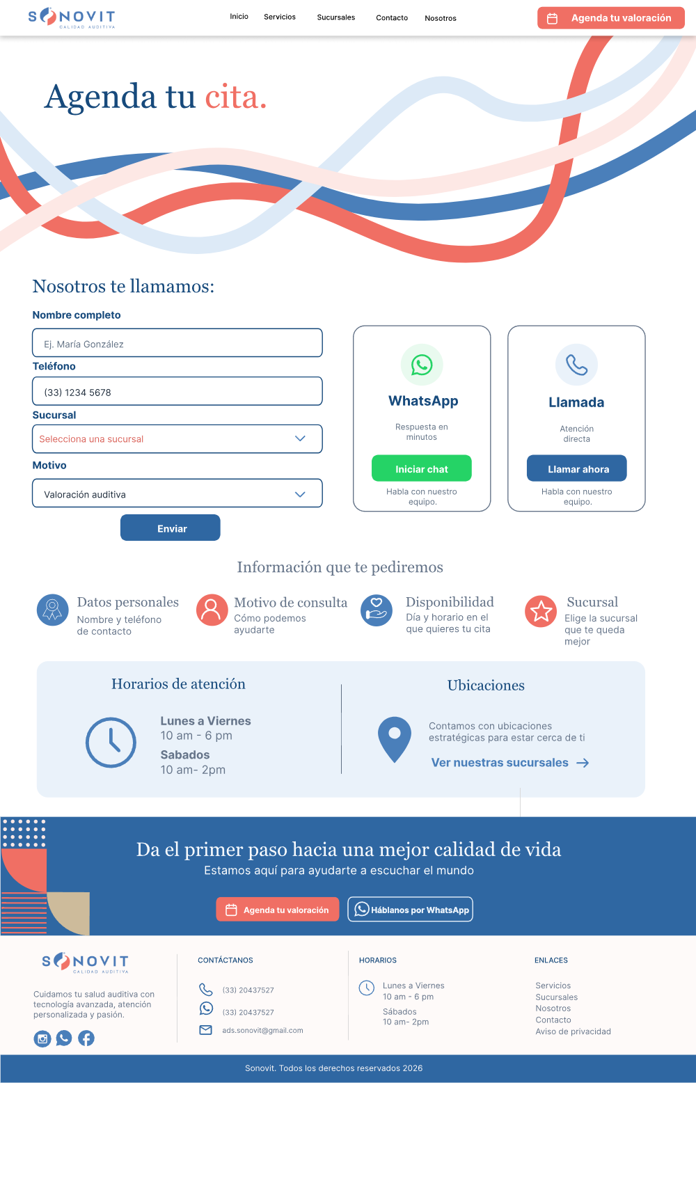
A five-page responsive website that guides users from concern to a confirmed evaluation — warm but credible, with blue, coral and real photography instead of a cold clinical interface. Summaries first, detail on demand, plain language throughout.
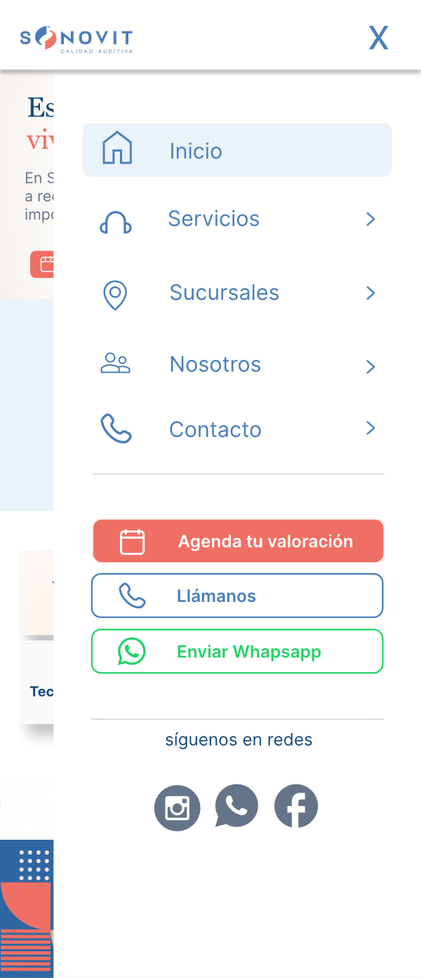
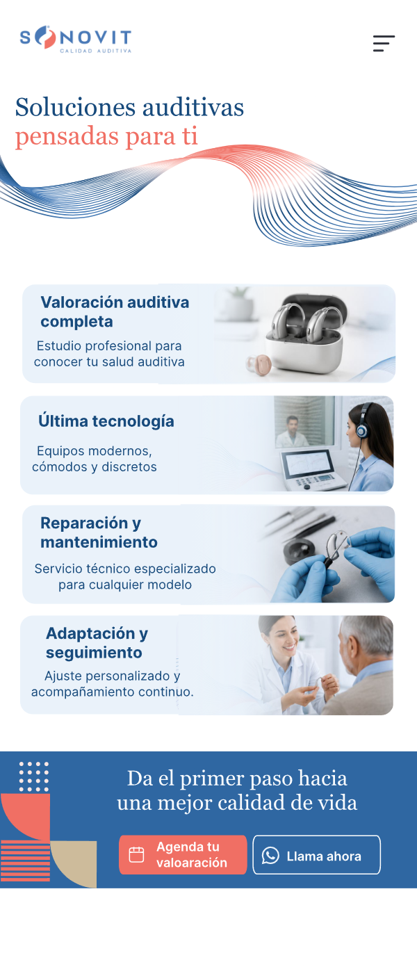
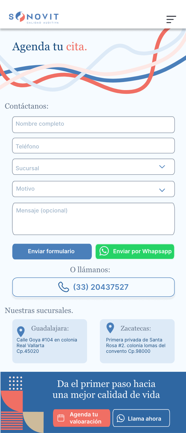
Most first searches happen on a phone. The shallow navigation becomes a full-screen menu where the three contact actions — book, call, WhatsApp — are one tap away.
Diagnosis is separated from product selection — the site always proposes a low-risk first step.
Brands, addresses, hours and a predictable process are distributed at every decision point, not parked in one “Why us” section.
WhatsApp, phone and form coexist — visible without giving every channel identical priority.
High contrast, short sections, visible buttons, large targets, no color-only meaning — accessibility as a core requirement.
Every decision traded something the business wanted for something the user needed.
The homepage opens with the human outcome — hearing better, staying part of the conversation — because caregivers respond to behavioral change, not device specs.
Trade-off — the commercially important product offer sits one level deeper, inside Services.
Uncertain users are directed to a consultation, not a catalogue — lower perceived risk, better-qualified appointments.
Trade-off — fewer direct product inquiries in exchange for appointments that actually convert.
High-intent users look for WhatsApp before reading anything. It’s persistent across the site, with phone and form as real alternatives.
Trade-off — a persistent contact action risks feeling commercial, so its visual weight stays deliberately controlled.
Early concepts were rows of identical cards — consistent but generic. Distinct compositions now signal content type: services, steps, evidence, locations.
Trade-off — richer layouts are harder to keep consistent, so spacing, type, buttons and color are locked system-wide.
The real product wasn’t a website — it was confidence, designed for the moment a family makes a hard decision.
My first instinct was to reorganize services. Research showed users first needed reassurance they were taking the right step.
Leading with hearing aids matched the business model — but not the user’s mental model. Understanding comes before shopping.
Tokens can stay fixed while layouts vary by information type. Repeating one card pattern made the site consistent — and forgettable.
It comes from what the clinic can actually promise — hours, addresses, a predictable process — not from messaging.