Problem
Tools built for competitive athletes, or generic trackers with no plan behind them.
A running planner designed to help recreational runners stay consistent without the complexity of traditional fitness apps.
A self-directed concept project, designed end to end — one product system that works as a phone app before a run and as a web dashboard after it.
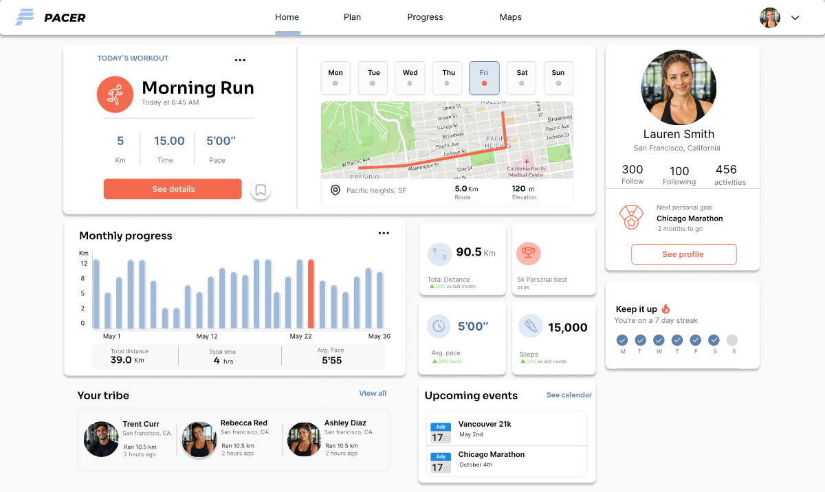
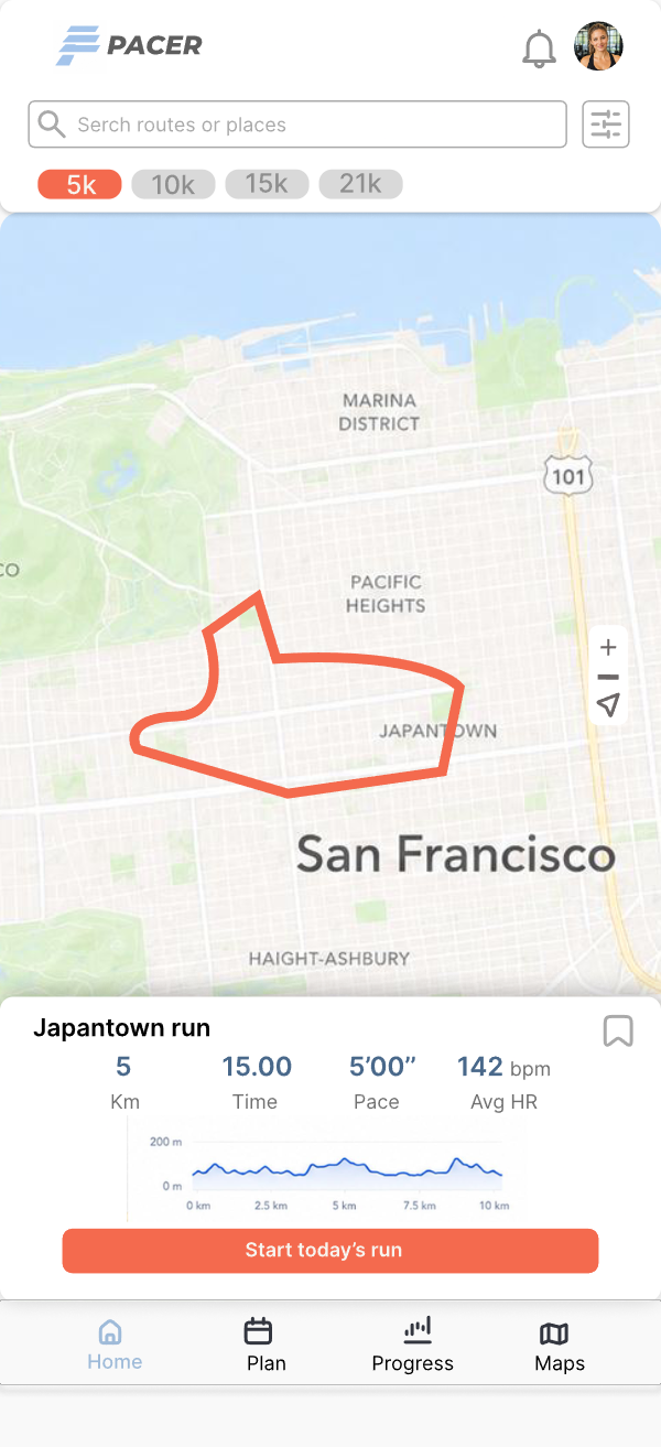
For recreational runners, that gap creates friction instead of consistency.
Tools built for competitive athletes, or generic trackers with no plan behind them.
Create a product that helps users plan, track, and stay motivated without overwhelming them.
A mobile-first experience that feels structured, approachable, and consistent across app and web.

“I want a simple plan that fits my routine and shows me I’m improving.”
Design persona: a composite I wrote to keep decisions consistent across screens. Not a research artifact — the questionnaire shaped the priorities, not this profile.
I sent a short questionnaire to a running group and built these insights from what came back: runners wanted less noise and more guidance.
Method & limits: self-reported answers from a self-selected group of runners. Directional, not representative — enough to prioritize features, not to size a market.
Users needed to know what to do today without navigating through multiple layers.
Simple summaries and visible milestones made improvement feel tangible.
Dense metrics and feature-heavy dashboards made tools feel intimidating.
Users wanted training and routes that fit real routines, not ideal schedules.
Five key areas support the runner’s journey from planning to progress.
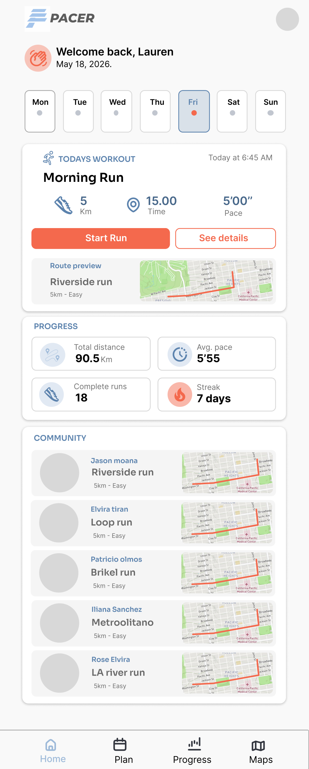
The flow always answers the runner’s first question — what do I run today? — before adding anything deeper.
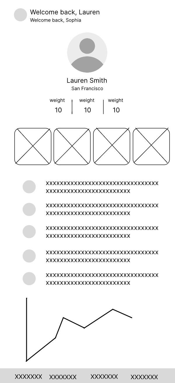
I drew every screen in low fidelity first to see whether it had a job. The ones that couldn’t answer a clear question in the sketch never got a visual pass.
To reduce friction, improve scannability, and give every screen one clear job.
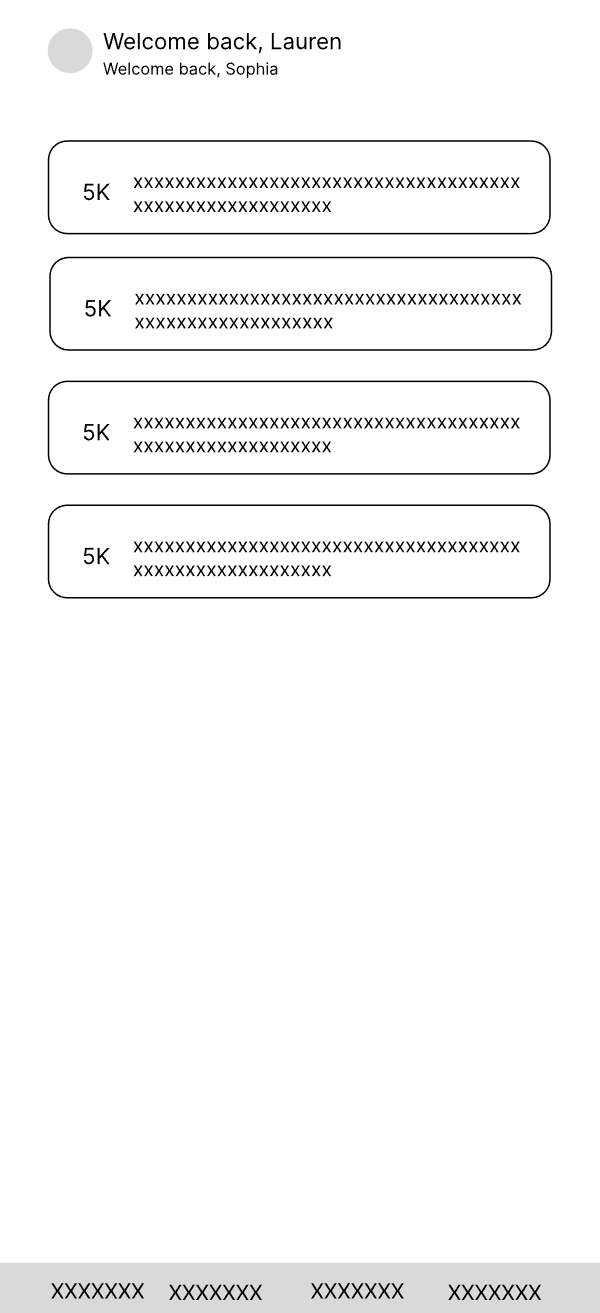
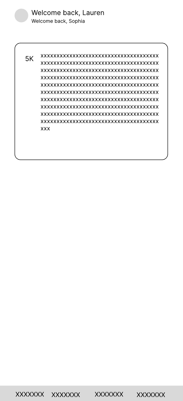
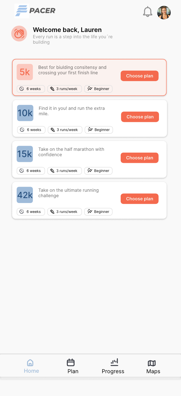
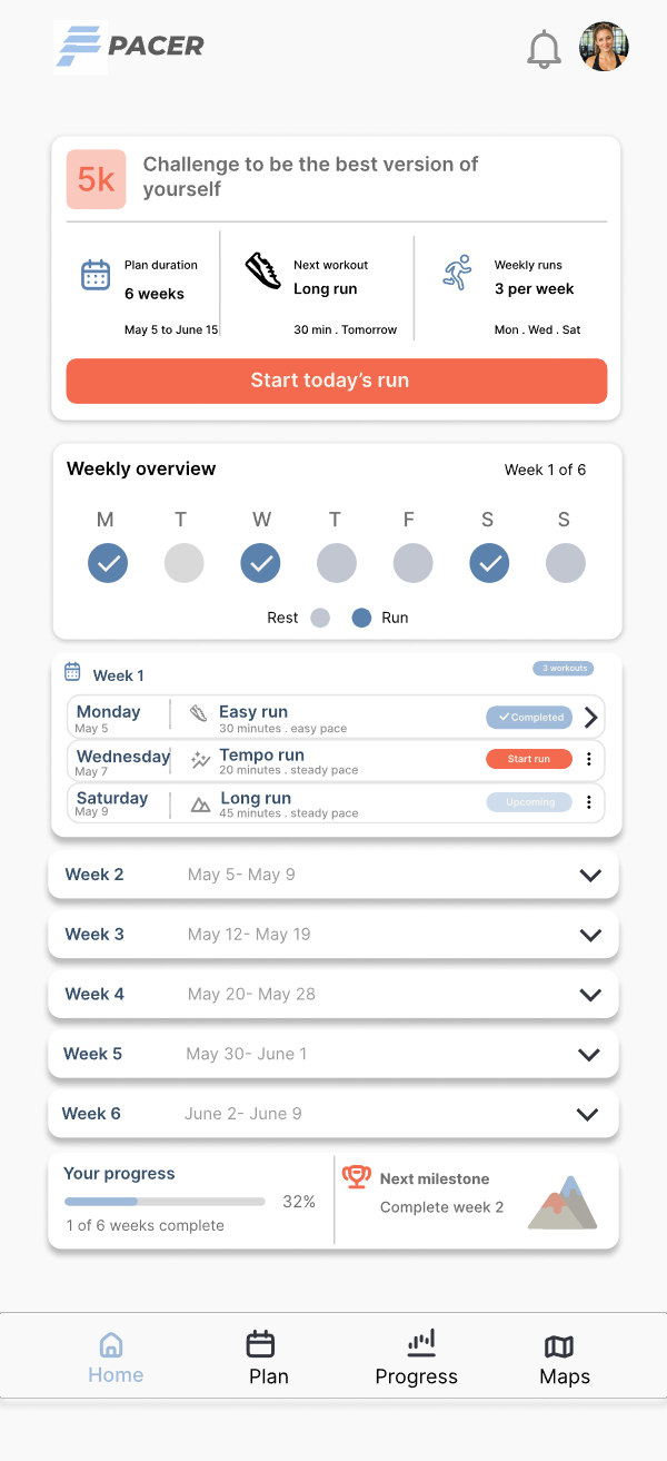
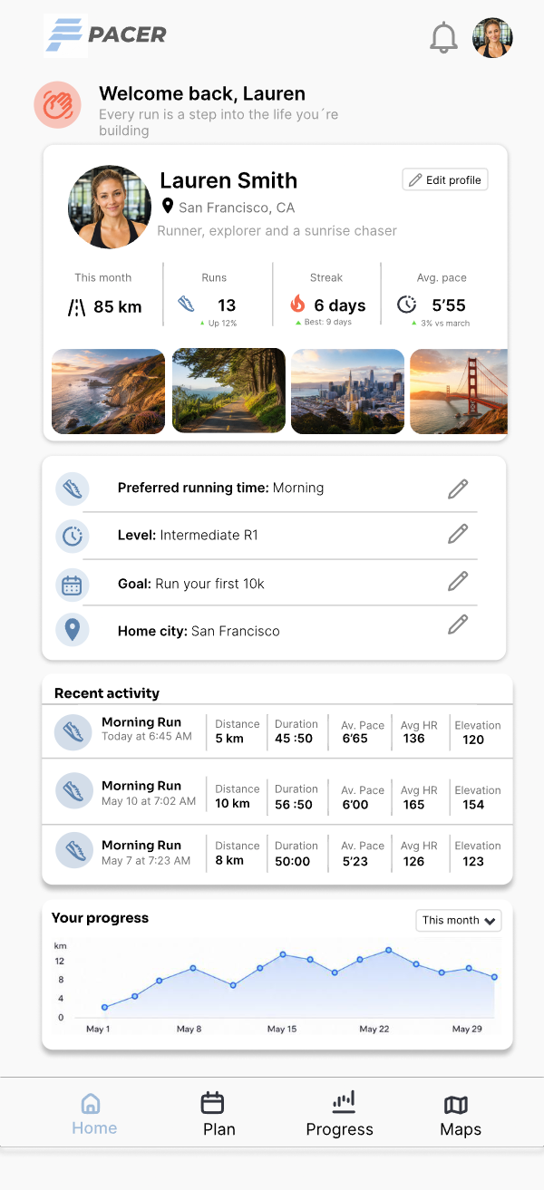
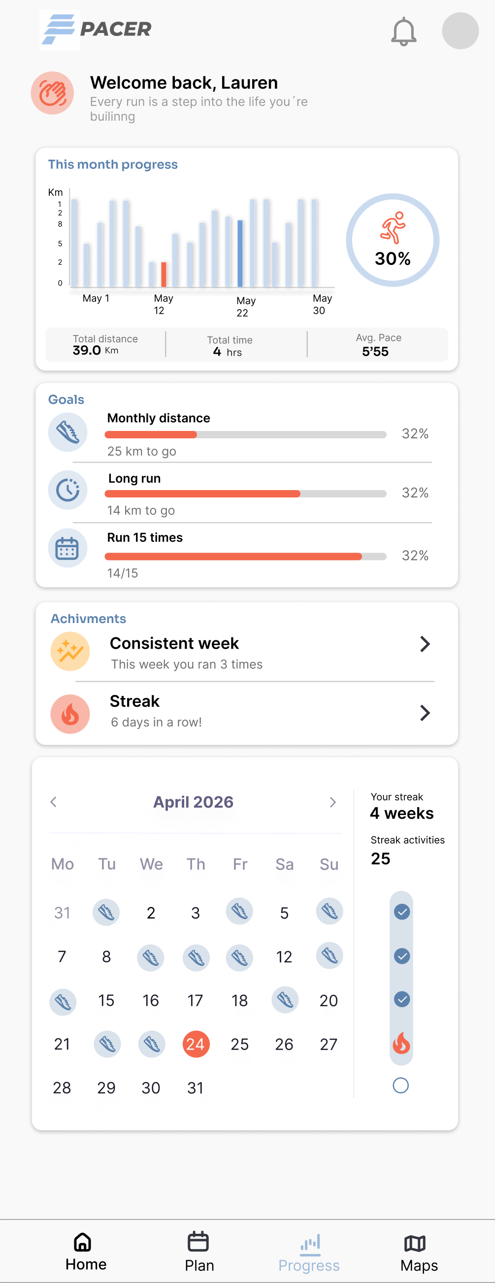
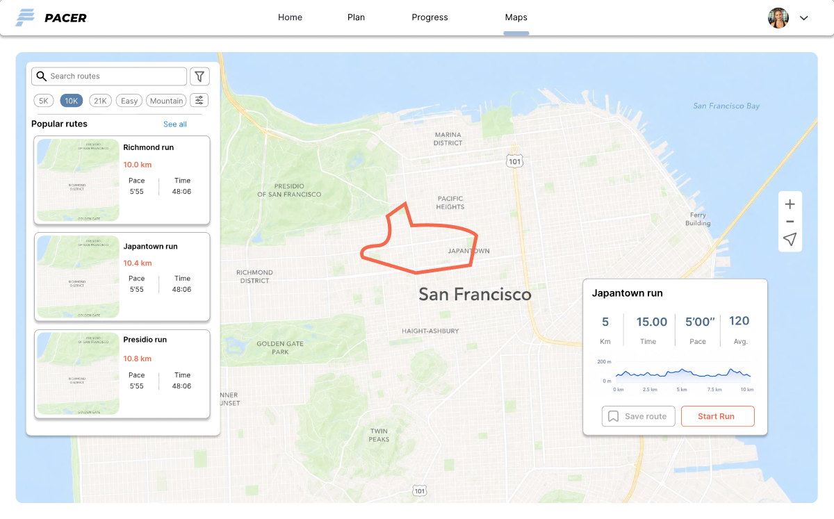
The final concept balances planning, progress and exploration across mobile and web — calm, motivating, easy to follow at a glance.
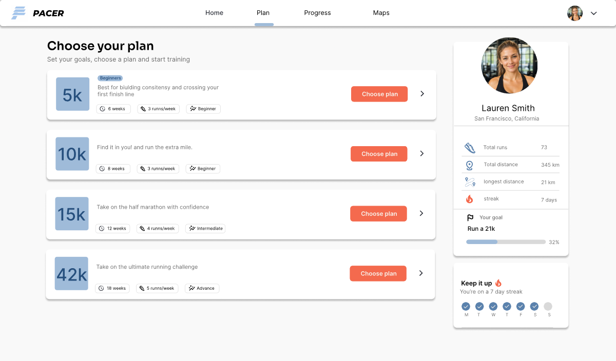
Compare options quickly and understand what fits your goal and level.
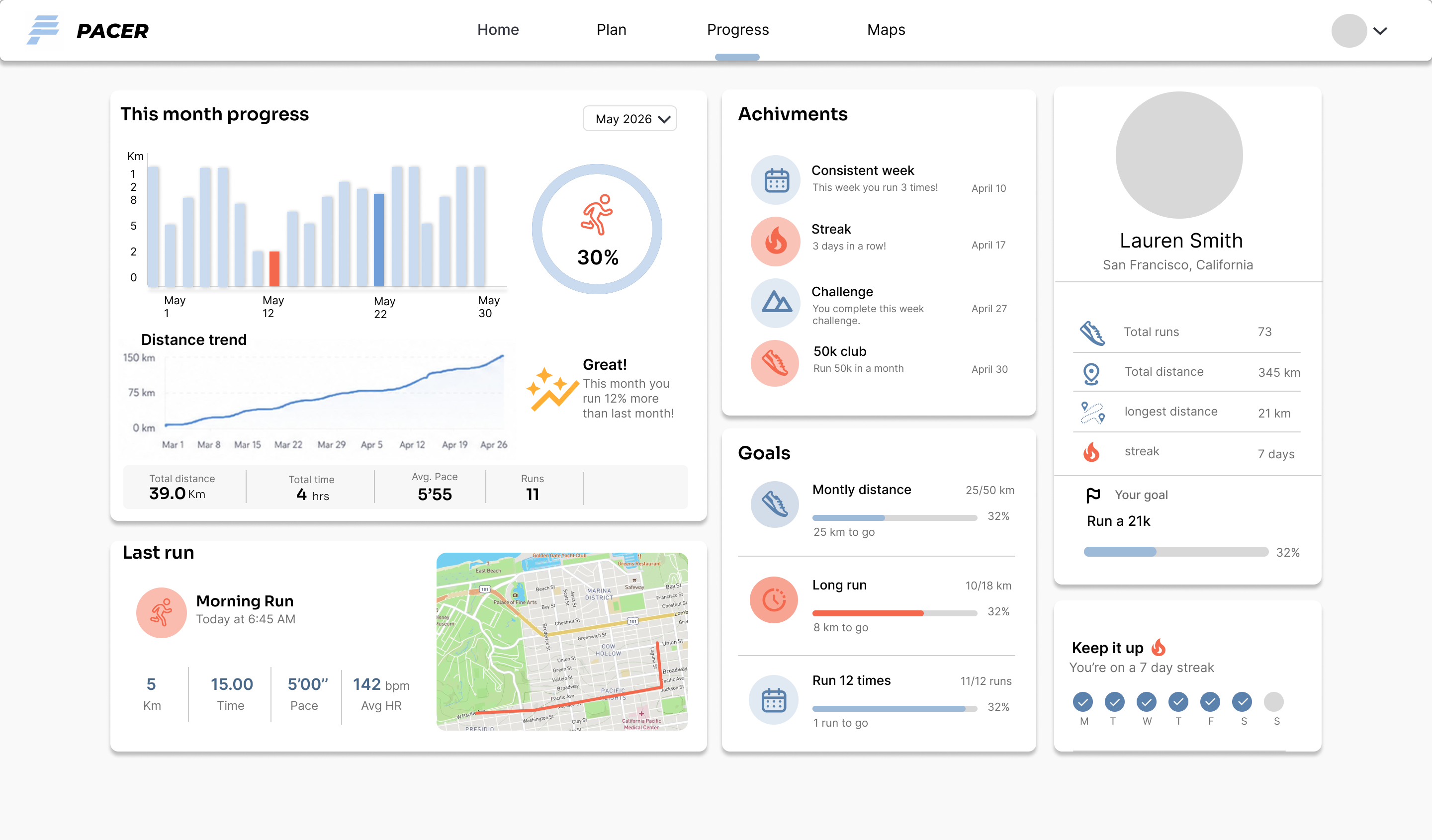
Goals, achievements and recent performance are surfaced simply.
Maps and route previews support discovery without overwhelming the flow.
The experience prioritizes habit-building over advanced athletic complexity.
Each of these took something a runner might want, to protect the one thing they need every day.
Home answers what do I run today? before anything else — plan, stats and history come after.
Trade-off — the full calendar and run history sit one tap deeper.
Each screen surfaces a handful of meaningful signals; deeper data stays available on demand.
Trade-off — experienced runners have to dig for splits and pace detail.
Web and mobile share one component system, but each layout was designed for its own context — not compressed.
Trade-off — slower to design and maintain than scaling a single layout.
Choosing a plan is a short guided decision, not an open library — the product always proposes a next step.
Trade-off — less up-front flexibility in exchange for a clear path.
Every improvement in this project came from removing something rather than adding it — harder to defend than it sounds.
Reducing noise and clarifying hierarchy had more impact than adding more features.
Data should motivate and reassure, not overwhelm or intimidate.
The strongest mobile screens came from rethinking structure, not translating desktop.
A clear visual and structural system made the experience feel more credible and scalable.